New Branding, Same Great Services

Learn more about Tang+Company's recent rebranding and our effort to offer industry-leading workplace health and safety solutions.
December 16, 2022

Author: Joseph Christian
December 16, 2022
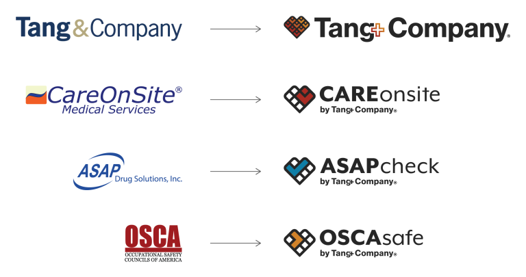
In early December, Tang+Company and its 3 business units updated their branding. Each new logo is designed to create a fresh look that better reflects the mission and values that have turned Tang+Company into a leading provider of health and safety solutions for businesses across America.

We introduced a heart symbol into our corporate and business unit logos to signify Tang+Company’s care-first philosophy to do the right thing for the people and businesses we serve.
We visually unified the style and appearance of our logos to reflect that we provide businesses across America with a single-source solution for occupational health and safety challenges.
Within the heart that forms the basis for each new logo, a unique symbol is used to represent the identity of each individual business unit.

Tang+Company (Also known as Tang & Company)
8 people represent our commitment to doing the right thing for people within and outside our organization.

CAREonsite (Formerly CareOnSite)
A person depicts the patients we care for, the clients we serve, and our employees who make it happen every day.

ASAPcheck (Formerly ASAP Drug Solutions)
A check to signify the peace of mind that clients gain knowing testing, screening, and compliance is handled.

OSCAsafe (Formerly OSCA)
An arrow stands for our mission of directing businesses and workers to safer practices.
CAREonsite – Occupational health services
Improve outcomes for workplace health services with access to quality care wherever your employees are.
ASAPcheck – Workforce screening
Simplify the administration of drug, alcohol, & background check programs.
OSCAsafe – Workforce training
Streamline the management of employee training & compliance requirements.